
A brand can have a polished logo, an attractive website, and a clean color palette and still feel strangely empty.
That usually happens when the individual pieces look good but do not belong to a larger idea.
Concept art helps solve that problem.
Before a campaign is photographed, a character is finalized, or a packaging system is produced, concept art gives the creative direction a visible form. It allows a studio and client to explore mood, setting, personality, materials, color, symbolism, and visual style while the idea is still flexible.
For film and games, concept art often defines characters, props, and environments. For brands, it can do something equally valuable: create a world that makes the identity feel distinctive and consistent.
At Raysome Studio, concept art connects brand strategy with character design, illustration, packaging, and campaign art. Instead of treating each deliverable as a separate asset, we use visual development to help everything feel as though it came from the same place.
This guide explores practical concept art examples and shows how early visual thinking can grow into a memorable brand world.
Quick Answer: What Are Concept Art Examples?
Concept art examples are early visual studies created to define how an idea should look and feel before final production begins.
Depending on the project, they may include:
- Character sketches and expression studies
- Environment or scene explorations
- Mood boards and visual references
- Color and lighting directions
- Packaging or product-world concepts
- Campaign style frames
- Illustration tests
- Shape-language studies
- Brand-world explorations
Concept art is not always polished. Its main purpose is not to be the final image it is to make creative decisions clearer.
A useful concept should help answer questions such as:
- What emotional atmosphere should the brand create?
- What makes this visual direction recognizable?
- How should characters, products, environments, and graphics relate?
- Which idea is strong enough to guide the final work?
Why Concept Art Matters for Brands
Many branding projects begin with a list of deliverables: logo, typography, colors, packaging, website, and social templates.
That list explains what needs to be made, but not necessarily what connects it all.
Concept art explores that missing layer.
It can establish whether a brand feels cinematic or restrained, playful or mysterious, handmade or futuristic. It can reveal whether the visual world should rely on characters, abstract forms, natural environments, architectural spaces, or product-led storytelling.
This makes concept art especially useful when a brand wants to become more than “clean,” “modern,” or “premium.” Those words are common. A visual world makes them specific.
The following examples show how that can work across different types of creative projects.
Example 1: A Skincare Brand That Avoids the Usual Beauty Look
Consider a skincare startup that wants to feel calm, premium, and imaginative.

The safe approach would be familiar: beige packaging, delicate typography, soft floral imagery, and bright product photography. That direction may be attractive, but it also risks disappearing into a crowded category.
A brand concept art phase could explore a more distinctive world based on translucent surfaces, liquid forms, botanical shapes, warm skin-toned light, and almost weightless product scenes.
The goal would not be to create one beautiful image. It would be to discover a visual language that could support the entire brand.
That direction might later influence:
- Frosted or gradient packaging finishes
- Floating product compositions
- Soft-motion website transitions
- Campaign imagery built around light and texture
- Editorial illustrations that feel organic rather than decorative
The concept art gives the brand a recognizable atmosphere before the identity system is fully developed.
Example 2: A Fashion Label Built Around Tension
A fashion brand may not need softness or familiarity. It may need tension.
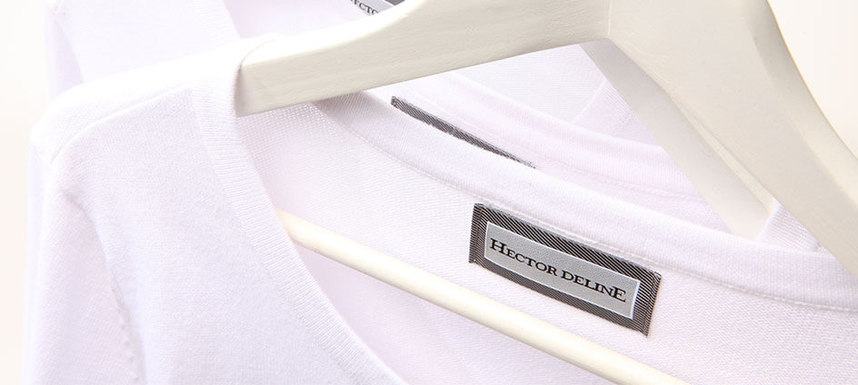
Imagine a label positioned between luxury and experimental editorial design. Instead of beginning with a logo and adding photography later, the team could first explore a set of campaign scenes: elongated silhouettes, severe shadows, reflective floors, compressed spaces, and fabric behaving almost like architecture.
In this case, concept art functions like a visual rehearsal.
It tests how the brand behaves before the shoot, lookbook, website, and social campaign are produced. The team can compare several directions:
Direction A: Minimal and cold, with sculptural poses and large negative space.
Direction B: Surreal and theatrical, with distorted rooms and exaggerated movement.
Direction C: Graphic and confrontational, combining bold typography with cropped figures.
Choosing between these ideas early prevents the final campaign from becoming a collection of unrelated “fashionable” images.
The result is not just a stylish identity. It is a brand with a point of view.
Example 3: A Children’s Story Where Character Design Comes First
For a children’s book or publishing project, the world often depends on whether the characters feel believable.
A friendly creature cannot simply be “cute.” Its proportions, posture, expressions, clothing, and movement should all support its personality.
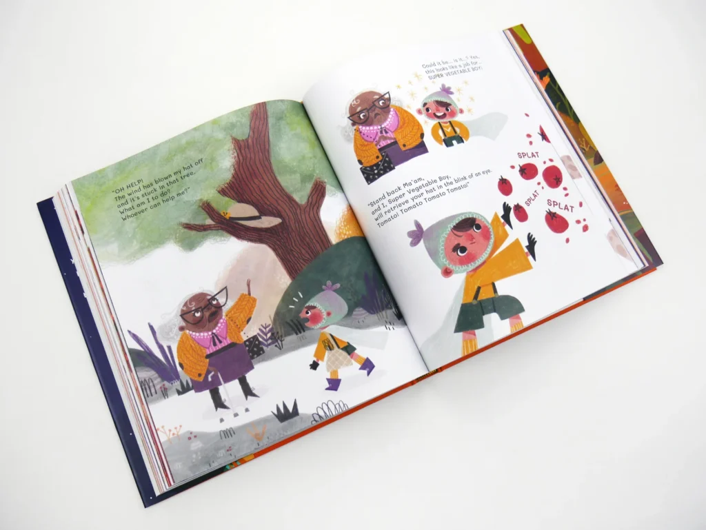
A character concept art process might begin with loose silhouette studies. One version could feel shy and rounded. Another might be tall and curious. A third could be energetic, with oversized hands and quick expressions.
Once the character direction is chosen, the environment can respond to it.
A quiet character may live in a soft, compact interior filled with handmade objects. A more adventurous character may need wider spaces, stronger contrast, and visual clues that encourage exploration.
This sequence matters. Instead of illustrating pages one by one and trying to create consistency later, the project establishes its visual rules first.
That can lead to stronger:
- Character sheets
- Expression libraries
- Color scripts
- Environment studies
- Cover directions
- Interior illustrations
- Promotional artwork
Here, concept art does not decorate the story. It helps the story become visually coherent.
Example 4: A Coffee Brand Organized Around a Daily Ritual
A coffee brand could easily rely on beans, mountains, mugs, and dark brown packaging.
A stronger direction might begin with a specific emotional territory: the quiet half-hour before the day becomes busy.
From there, the concept art could develop a recurring world of blue dawn light, small apartment windows, rising steam, warm interior rectangles, and one consistent illustrated figure preparing for work.
This direction changes the role of the product.
The coffee is no longer presented as another premium roast. It becomes part of a recognizable ritual: focus before noise.
That central idea can guide the packaging, website, short-form content, campaign art, and even the way product photography is lit. Steam may become a repeated graphic element. Window shapes may influence layouts. The character may return across seasonal campaigns.
The brand world becomes useful because it can keep generating new content without losing its identity.
Example 5: A Tech Product That Needs to Feel Human
Many technology brands rely on the same visual shorthand: gradients, interface mockups, abstract shapes, and simplified icons.
Concept art can help a digital product communicate how it improves life rather than simply showing what the interface looks like.
Suppose a productivity platform wants to represent clarity.
Instead of starting with screenshots, the visual development might explore scenes in which complex environments gradually become calm and ordered. Light could act as a metaphor for progress. Human figures could move through spaces that shift from cluttered to open.
That concept can then inform onboarding illustrations, website transitions, presentation graphics, launch videos, and social campaigns.
The visual system stays connected to the product benefit without repeatedly saying, “We make work easier.”
This is one of the most practical uses of concept art for brands: turning an abstract promise into something people can immediately feel.
Example 6: A Product Launch With a Strong Campaign Idea
A product launch often fails visually because it begins too close to the final execution.
The team books photography, creates ads, and designs social assets before agreeing on the central image or emotional idea.
Concept art gives the campaign room to test different worlds first.
For a fragrance launch, one direction might place the bottle in a moonlit architectural space with reflective surfaces and drifting smoke. Another might treat the scent as a character, using a silver silhouette moving through botanical forms. A third might focus on extreme close-ups of texture, glass, skin, and condensation.
These are not minor styling variations. They are different campaign ideas.
Reviewing them as style frames or visual studies helps the client choose the strongest creative territory before investing in final production.
Once selected, the concept can guide:
- Photography or 3D art
- Launch-film scenes
- Packaging presentation
- Retail graphics
- Social media assets
- Editorial illustrations
- Motion direction
The campaign becomes more consistent because every execution grows from the same visual premise.
What Makes a Strong Concept Art Example?
Not every rough sketch is useful concept art. A strong example should make the direction easier to understand and evaluate.
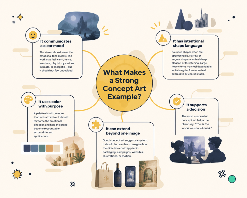
It communicates a clear mood
The viewer should sense the emotional tone quickly. The work may feel warm, tense, luxurious, playful, mysterious, intimate, or energetic—but it should not feel undecided.
It has intentional shape language
Rounded shapes often feel approachable. Narrow or angular shapes can feel sharp, elegant, or threatening. Large, heavy forms may feel dependable, while irregular forms can feel expressive or unpredictable.
These choices help characters, products, and environments share the same personality.
It uses color with purpose
A palette should do more than look attractive. It should reinforce the emotional direction and help the brand become recognizable across different applications.
It can extend beyond one image
Good concept art suggests a system. It should be possible to imagine how the direction could appear in packaging, campaigns, websites, illustrations, or motion.
It supports a decision
The most successful concept art helps the client say, “This is the world we should build.”
What a Concept Art Engagement Can Include
A client considering concept art services should know what the process may look like in practical terms.
The exact scope depends on the project, but a typical engagement can include the following stages.
1. Discovery and Creative Brief
The studio begins by understanding the brand, audience, project goals, references, competitors, practical requirements, and desired emotional response.
This stage identifies what the work must communicate, not only what it should resemble.
2. Visual Research
The team gathers references around shape, material, culture, lighting, composition, character, environment, typography, and image-making style.
This research is used to define possible territories rather than copy existing work.
3. Direction Exploration
The studio develops several early creative routes. These may appear as rough sketches, mood boards, thumbnails, color studies, character silhouettes, or campaign style frames.
The purpose is to compare genuinely different ideas.
4. Client Review
The client reviews the directions and provides focused feedback. A preferred route is selected, or useful elements from related directions are combined where appropriate.
5. Refinement
The chosen concept is developed with greater clarity. Characters, environments, compositions, materials, and color relationships become more specific.
6. Final Concept Package
Depending on the engagement, the final delivery may include:
- Approved style frames
- Character sheets
- Environment studies
- Color and lighting direction
- Mood boards
- Campaign concepts
- Product-world visuals
- Packaging visual direction
- Notes for illustration, motion, photography, or production
Some projects end at the concept stage. Others continue into brand identity, character design, illustration, packaging, or campaign production.
The timeline depends on the number of directions, complexity of the world, and level of refinement required. What matters is that the process creates alignment before final production begins.
How Concept Art Supports Brand Identity
Concept art and brand identity are different disciplines, but they become stronger when they support one another.
A visual identity provides structure through logos, typography, color, layout, and graphic rules.
Concept art gives that structure atmosphere.
It can help determine what kind of photography belongs to the brand, how illustration should behave, whether characters should appear, what environments feel appropriate, and how campaign visuals can stay connected over time.
Together, they can shape:
- Brand identity systems
- Packaging design
- Character-led campaigns
- Website art direction
- Editorial illustration
- Product launches
- Social content
- Motion graphics
- Brand storytelling
This is why a brand world is more useful than a single campaign look. It creates a repeatable creative foundation.
How Raysome Studio Builds Brand Worlds
Raysome Studio is a Wyoming-based concept art studio working across brand identity, character design, illustration, packaging direction, and visual storytelling.
Our process begins by identifying the emotional and strategic center of the project. From there, we explore the shapes, settings, characters, materials, and visual behaviors that could make the idea recognizable.
For one project, that may mean developing a character system before the logo is finalized. For another, it may involve designing a campaign environment that later shapes photography, packaging, and social content.
We are not interested in adding concept art simply to make a presentation look impressive.
It should solve something.
It should clarify the direction, give the brand more personality, and make the final work feel connected rather than assembled.
Final Thoughts
The best concept art examples do more than show drawing skill. They demonstrate how an idea becomes a visual system.
A skincare brand can become a soft, translucent dream world.
A fashion label can build an identity around tension and silhouette.
A children’s story can grow from the personality of one character.
A coffee product can become part of a recognizable daily ritual.
A technology platform can make an abstract benefit feel human.
A product launch can become a campaign people remember.
In every case, concept art creates clarity before polish.
It gives the creative team a world to build—not just a list of assets to produce.
Build a Brand World With Raysome Studio
A memorable brand needs more than separate good-looking pieces. It needs a visual idea strong enough to connect them.
Raysome Studio creates brand identity, concept art, character design, illustration, packaging direction, and campaign visuals for startups, authors, lifestyle brands, and ambitious creative projects.